Metroid Fusion Repalette
Release date: Aug 12, 2018
Download: Version 2.1.4 (4610 downloads)
Genre: Improvement [?]
Game: MF
Difficulty: Vanilla [?]
Average runtime: 1:55
Average collection: 80%
Read Me: [None]
Forum Thread: Release Thread
Rating: Star Star Star Star Star
Description
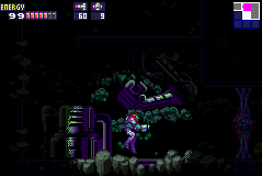
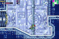
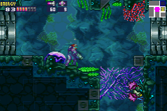
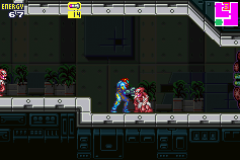
A small hack that retools some of Fusion's less appealing assets. The primary changes include complete recoloration of all tilesets and several objects to be less jarringly saturated as necessary, as well as repalettes of Samus herself and some enemies. Red lines have been removed from outlines and certain areas look entirely different to help create a more tense atmosphere.

There are very few rooms that have actually been changed aside from this. The mandatory missile tank and the pre-Arachnus energy tank have been moved from their original spot to elsewhere in the same room to make them more easily skipped, and one Save Station in NOC has been removed to make things a bit more tense and difficult there. The hack also uses Biospark's IBJ/Single Wall Jump tweak and changes a couple of rooms to accommodate.

Credit for many of the room changes and the general idea for the hack goes to Doc Anon and JKMaxx of the Metroid Community Discord! The original hack was sadly abandoned but I did get permission to use everything that was available and expand on it. I hope this lives up to what was planned for the hack and helps improve the original Fusion!
Screenshots
Screenshot Screenshot Screenshot Screenshot
Ratings and Reviews
By Spedimus on Mar 02, 2019 (Star Star Star Star Star )
64% in 1:21
This hack definitely did what it set out to do. The re-palettes in each area were amazing. Some of my personal favorites were underwater AQA and NOC. The recolored Varia Suit from M:SR is a welcome change. There's a lot of great QOL changes.

I still have a few gripes outside of the re-colors. During the powerbomb event you can trigger the computer's error message by bomb jumping out of SA-X's encounter room. There were also some bugs involving monologues having too much text, specifically at during the epilogue. There were just some buggy messages in general. Also, IMO, Samus's monologues really didn't need to be changed. I enjoyed the references to previous Metroid titles though.

Overall, a solid improvement of vanilla Fusion.
By MetroidNerd#9001 on Mar 03, 2019 (Star Star Star Star Star )
100% in 1:59
A nice refreshing look at Fusion. I don't like all of the palettes, but most of them are pretty good, and the rest are mostly underwhelming. It's fun to play through again; underwater AQA is beautiful. There are still a few bugs, but nothing too major.
By albert v. on Mar 07, 2019 (Star Star Star Star Star )
No completion stats.
By Laser on Mar 08, 2019 (Star Star Star Star Star )
100% in 1:07
Metroid Fusion Repalette v2.1.4 Review

This hack is fun, to say the least. Biospark's IBJ/Single Wall Jump Patch definitely made playing it more interesting, but what the hack aimed for still seems mostly presentable.

The best changes were definitely the Underwater Sector 4, which just looks incredible; most of Sector 6, being a lot darker; and the Varia Suit, finally appealing to look at. The worst changes, at least for me, were the excessive use of the color white and all of the unnecessarily modified dialogue, especially Samus's.

First of all, I like the removal of those giant red borderlines, present in almost every tile in the original. It helps viewing both the background and foreground as one single area, not obviously separated. As for changing the tiles themselves, I would prefer if they were changed to look more realistic, and not just looking the same with a modified color. Sadly, it's only done noticeably in the yellow portion of the Main Deck, while most of the game remains flat-looking.

As for the changed colors, I've noticed most sceneries were made more white. The "pink" portion of Sector 1 (like the 1st Eye-Door room), the blue portion of Sector 4 (like the elevator room), the cold rooms in Sector 5 (as well as frozen Ridley room), the Reactor Core room in the Main Deck, and so on, ALL have been changed to be more white. That directly makes the game less colorful, which, while arguably helping it "create a more tense atmosphere", doesn't change the fact that it goes AGAINST the idea of recolorizing the original. My problem with Fusion's tiles doesn't come from its colors, it comes from its flat 2D aesthetics, something that was greatly improved in Metroid Zero Mission.

Now, as for the dialogue, yes, there are still some glitchy textboxes that need to be fixed, but that doesn't really affect the gameplay experience, and therefore is irrelevant to the point I'll try to bring here. The thing is, I don't have a single problem with the writing, pacing or storytelling in Fusion. For me, it could stay the way it is. However, if you do want to see it changed, I don't think this is what you are looking for.
From what I've read, the intent here was to make the dialogue simpler, removing some technical terms and shortening explanations, which is fine. Unfortunately, that also came With making existing dialogue more bland. I can't really explain what I mean, but here is a really good example of how this was all changed:

Original:
"'Do not worry. One of them will understand. One of them must.'
I've reflected upon his words, and I see the wisdom in them."
Hack:
"'Do not worry. One of them will understand. One of them must,' Adam says.
I see the wisdom there."

It somehow makes the game less immersive, like a constant reminder that this is a hack, when in the original it sounds more natural and impactful.

In the end, this makes for an OK romhack, a bit disappointing considering the potential it had to be a great hack, but OK nonetheless. Definitely worth a bit more work on it, fixing some textboxes, maybe speeding up elevators, and making so that Bob (The Sector 3 Missile Tank) doesn't disappear in future visits, even if you haven't collected it. 3 out of 5.
By DestroyerOfAglets on May 28, 2019 (Star Star Star Star Star )
64% in 2:12
I've been playing Fusion since I was just a few years old, and this hack was like a breath of fresh air. There are still a few bugs with the text boxes that could be ironed out, but it certainly made replaying the game much less of a chore. It was fun to find all the little changes in the dialogue. Also, it seems as if the cut scenes are shorter? or maybe that's just me.

Overall, good work. It's a great way to play Fusion.
By metasamus on May 19, 2020 (Star Star Star Star Star )
No completion stats.
Great!
By Azagroth on Feb 17, 2021 (Star Star Star Star Star )
No completion stats.
Visually incredible. My only issue is the new text that can be very cheesy imo.
By Cosmic on Oct 14, 2022 (Star Star Star Star Star )
72% in 2:57
[Watch Video]  
The title of this hack is incredibly misleading and is the main reason for many of the gripes I have with this hack. There are honestly so many issues I have with this that it would take me at least an hour to put them all down into words. I'll try to keep it short.

For a hack whose primary intention is to change the palettes, there sure is a lot more unnecessary changes than there needed to be. There are changes in text, graphics, and even mechanics that really had no purpose being there.

Why allow players to SWJ and IBJ if it doesn't get them anywhere? If you have to add path blockages in to force people into the intended path? the SWJ patch actually makes arachnus a little harder because you now have to jump extend to get past the flames.

Why was the level design changed? Admittedly, I did like the pit block in the first SA-X encounter, but aside from that the rest of the design changes felt shoehorned to cut off sequence breaking (as said above) or to make edgier gorier rooms in sector 6 that are the metroid hack equivalent of using breaking benjamin's blow me away in a halo mod. I know what the intent was and I'm sorry. I still just found this to be really cringe.

The same goes for the text changes. The nods to the prime series and other m were nice, but the character of both Samus and ADAM were compromised by incredibly cheesy, edgy, convoluted dialogue that doesn't match how they spoke in vanilla. In some cases, these dialogues/monologues are longer than vanilla's, because reasons.. Seriously though, when has Samus ever said "Cowed?" This is just really bad fanfiction territory that makes no effort in adhering to the source material. These edits also tend to come with a lot of jank, like textboxes in dialogues not clearing before ADAM or Samus respond to each other, or setting music that immediately gets taken back away, or corrupted graphics in place of text or randomly on the screen.

The authors of the hack also seem to completely miss the point of ADAM's flavor text, either not using it when they should or using the wrong color which again, makes it come across as amateur's work. For example on a Main Deck dialogue, they put X Parasite in red text.
The main 2 text colors adam will use are yellow, and purple. Yellow is a highlight of key information so players know what's important as they read and/or skim through. Purple text is used to indicate locations. Sector 5 (ARC), SR388, Habitation Deck, etc. The only times that ADAM will use other colors is when mentioning the green and blue X parasites, and the level door locks.

Admittedly, I also did like that this hack tried out some unused or unterutilized enemies, and even weakened some infamous enemies like Yakuza, but this didn't really feel necessary and in some cases was quite jank, like all the Skrees just before the Lv1 security computer just kind of going all over the place in that room.

There's a lot of broken stuff too, probably the result of image-importing tilesets. For example, unlocked hatches often won't animate properly, and their transitions are screwed up. Minimap tiles appear to have been edited in some way because when opening the map screen there are these weird black dots on many of the tiles. The animation for obtaining Varia suit is messed up. There's a tileset in sector 6 that's a pixel shorter than it should be which leads to floating doors. For some reason Wide Beam was renamed to Spazer for what I can only guess is continuity's sake...? But the color of it is still purple and its behavior is different from spazer beam in SM so this is another nonsensical choice IMO.

Lastly, the palettes. I saved these for last because I do have at least some good things to say about them. While I don't agree with all the color choices made, Sector 6 and the depths of Sector 4 looked phenominal. Unfortunately, it feels half-baked in that there are still many occasions where maroon outlines still exist (they're now especially more obvious since in 99% of cases they've been changed to better fit the rest of the tileset instead), destroyed hatches in sector 2 still look like they've been petrified rather than destroyed, and some areas just look like straight up downgrades. Looking at you cave background in sector 1 that's just been desaturated into big brown blobs. There are also many spots where the color of "filler" tiles still have their weird coloration, like all main deck elevator rooms having this light brown filler instead of the pitch black that you see as you descend into a sector. Enemies like the blobs covering the ventilation shafts in SRX no longer having palettes that line up with the rest of the rooms' tileset. The animated palettes for charging beams were half-done, some of them looking pretty good and others like plasma with varia suit being almost concerning for people with epilepsy. I also personally did not like how much white there was. I prefer the look of the vanilla main deck with its warm lobby look. Definitely has more personality than generic white and blue sci-fi area #2891437. Making the Blue X white was also quite silly if you ask me.

I really do not think that this hack should be in the Improvement category. It's more of a Vanilla+ hack, like playing Metroid Fusion if a hacker had recreated it from scratch with just their memory. I'll give credit where it's due but I really don't like most of the changes here.

Finished.
Do Not Recommend.

You must login to rate this hack