
| Zero Mission: Wrieke Ullrhd | ||
Release date: Apr 26, 2023 |
Author: alexman25
|
Download: Release 1.0 (310 downloads) Download: Raw Files (7 downloads) Download: NO REPOINTS (8 downloads) |
Genre: Improvement [?] Game: 
|
Difficulty: Vanilla [?]
|
Average runtime:
Pending
|
Forum Thread: [None] |
Rating:
Pending
|
|
Description
Release 1.0 - The hack as intended to be played by itself or used as hack base
NO REPOINTS - Minor differences meant for compatibility with Randomizer Plus and other hacks (General rule of thumb is to apply Wrieke Ullrhd second!)
RAW FILES - Just the palettes and raw gfx isolated on their own
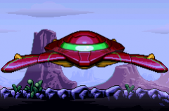
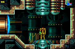
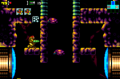
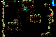
My biggest problem with Zero Mission's art-style is probably the colors. The boring white lighting, the nauseating maroon outlines, the immersion-breaking blue filler, the boring de-saturated colors, and the overall lack of cohesion and depth between foreground and background elements.
Zero Mission: Wrieke Ullrhd is a hack that aims to remedy Metroid: Zero Mission's coloring problems. Most in-game palettes have been changed to both make the game look "better", as well as bringing the game more in-line with NEStroid and Super Metroid in terms of atmosphere.
Minor changes to some art have been made to fit the new palettes.
NO REPOINTS - Minor differences meant for compatibility with Randomizer Plus and other hacks (General rule of thumb is to apply Wrieke Ullrhd second!)
RAW FILES - Just the palettes and raw gfx isolated on their own
My biggest problem with Zero Mission's art-style is probably the colors. The boring white lighting, the nauseating maroon outlines, the immersion-breaking blue filler, the boring de-saturated colors, and the overall lack of cohesion and depth between foreground and background elements.
Zero Mission: Wrieke Ullrhd is a hack that aims to remedy Metroid: Zero Mission's coloring problems. Most in-game palettes have been changed to both make the game look "better", as well as bringing the game more in-line with NEStroid and Super Metroid in terms of atmosphere.
Minor changes to some art have been made to fit the new palettes.
Screenshots
Ratings and Reviews
This hack has not yet been rated.
You must login to rate this hack
You must login to rate this hack


